
Imagine stepping into a room where every plant, pot, and decorative element seems to perfectly complement each other, creating a serene, cohesive atmosphere. This is the magic of color-coordinated houseplant styling. Whether you’re an experienced plant parent or just starting your indoor garden, styling your plants with color in mind can elevate the entire vibe of your space. In this article, we’ll explore practical tips and creative ideas to help you master color-coordinated houseplant styling, turning your home into a harmonious oasis of greenery and vibrant hues. Ready to transform your space? Let’s dive in!
Understanding the Basics of Color Coordination in Houseplants 🌿🎨
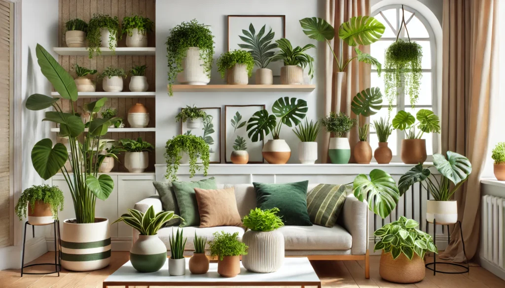
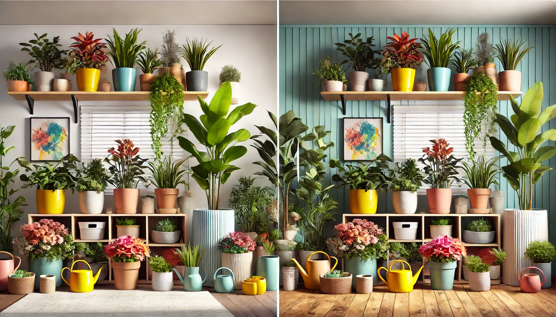
Color-coordinated houseplant styling is all about creating a balanced, visually appealing space by matching plants with their surroundings. 🌱 But how does color coordination work when it comes to plants? Let’s break it down!
- The Power of Greenery
Green plants are the perfect neutral element in any color scheme. Their natural tones blend effortlessly with almost any interior, from bold to subtle palettes. 🌳 Whether you have deep emerald ferns or light, fresh succulents, green is versatile and calming, making it a great base for your design. - Accent Colors for Vibrancy
Plants don’t just come in green! 🌸 Some plants have vibrant red, purple, or yellow leaves, or even colorful flowers. Using these plants strategically adds bold accents that pop against neutral walls or other plants. For instance, pairing a red-leafed plant with a cream-colored pot can add instant drama. 🌺 - Balancing Contrast
When coordinating colors, balance is key. Pair bright-colored plants with soft-toned pots to create contrast without overwhelming the space. For example, a vibrant purple plant looks stunning in a muted white or beige pot. This contrast draws attention to the plant while maintaining harmony in the room. 💫
By understanding these basic principles, you can start styling your plants in ways that make every corner of your home feel cohesive and thoughtfully designed! 🌟
Identifying Key Plant Colors and Their Influence 🌿🌈
Choosing the right colors for your plants can make all the difference in how your space feels. Each plant color has its own unique influence, creating different moods and effects in your home. Let’s explore the key plant colors and how they impact your decor. 💚
Shades of Green 🌱
Green is the most common and calming color in houseplants. It ranges from soft, pastel greens to deep, rich emerald tones.
- Light greens give a fresh, airy vibe, perfect for brightening up a room. 🌿
- Dark greens add sophistication and depth, creating a relaxing, cozy atmosphere. 🍃
- Variegated greens, with a mix of lighter and darker tones, bring a dynamic yet balanced feel to any space.
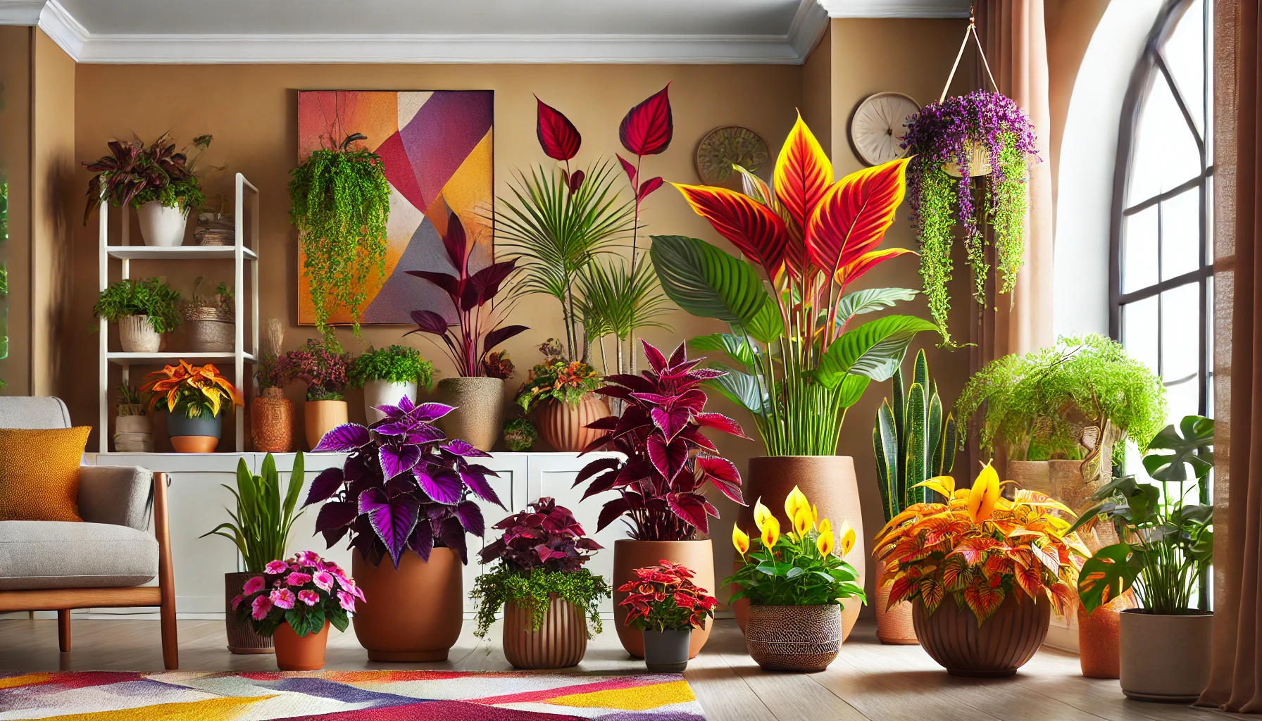
Bold Accent Colors 🌺
Plants with non-green leaves or flowers can create bold focal points in your home.
- Red & Purple: Plants like red-leafed coleus or purple shamrocks add dramatic flair, making them ideal for statement pieces in a room. These colors evoke warmth and energy. ❤️💜
- Yellow & Orange: These colors are vibrant and lively, perfect for creating a cheerful and inviting atmosphere. Think of bright maranta or the cheerful blooms of a peace lily. 🌻🍊
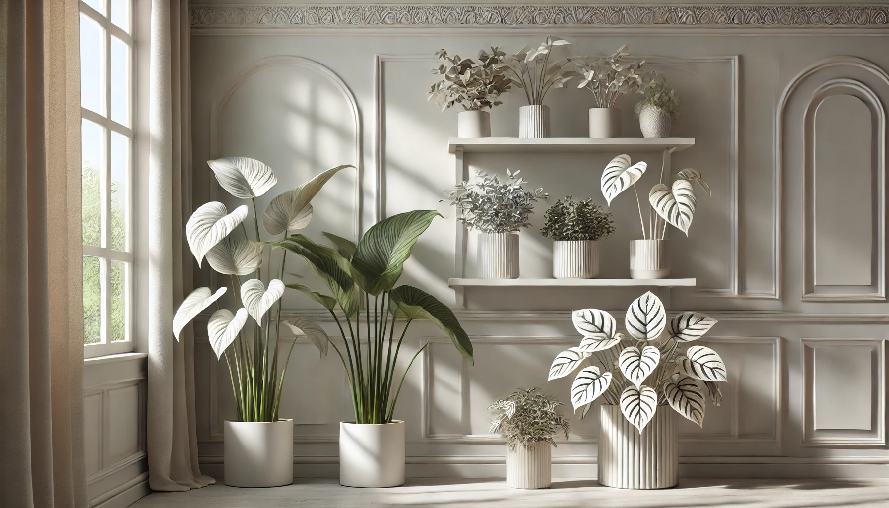
White & Silver 🌾
Plants with white or silver hues, like the silver pothos or white-striped calathea, can bring a touch of elegance and softness to your space. These colors help brighten darker corners, adding lightness and a sense of tranquility. 🤍✨
By thoughtfully choosing plant colors, you can enhance the mood and atmosphere of any room, creating a harmonious environment that suits your style.
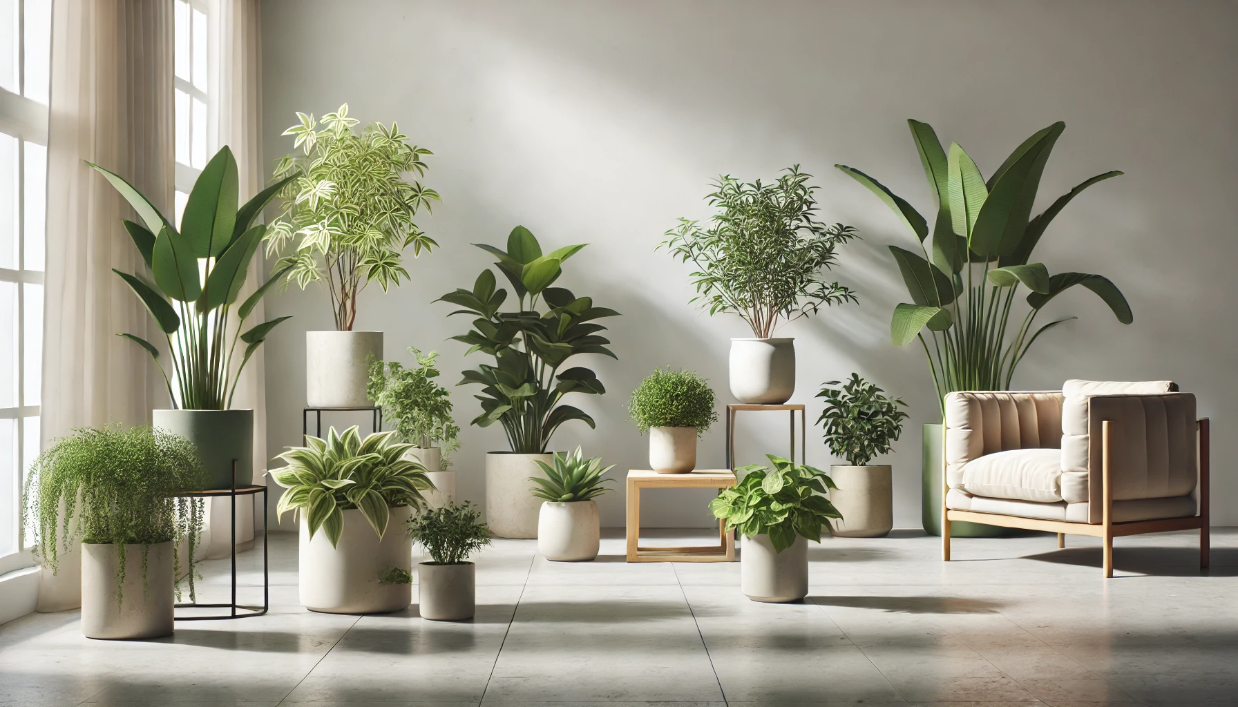
Choosing the Right Containers for Color Coordination 🪴🎨
The right pot or container can elevate your plant styling and tie everything together! When it comes to color-coordinated houseplant styling, selecting the right containers is just as important as choosing the plants themselves. Here’s how to pick the perfect pots to complement your plants. 🌿
Match Pots to Plant Colors 🏺
One of the easiest ways to create a cohesive look is by choosing pots that complement or contrast with the plant’s color.
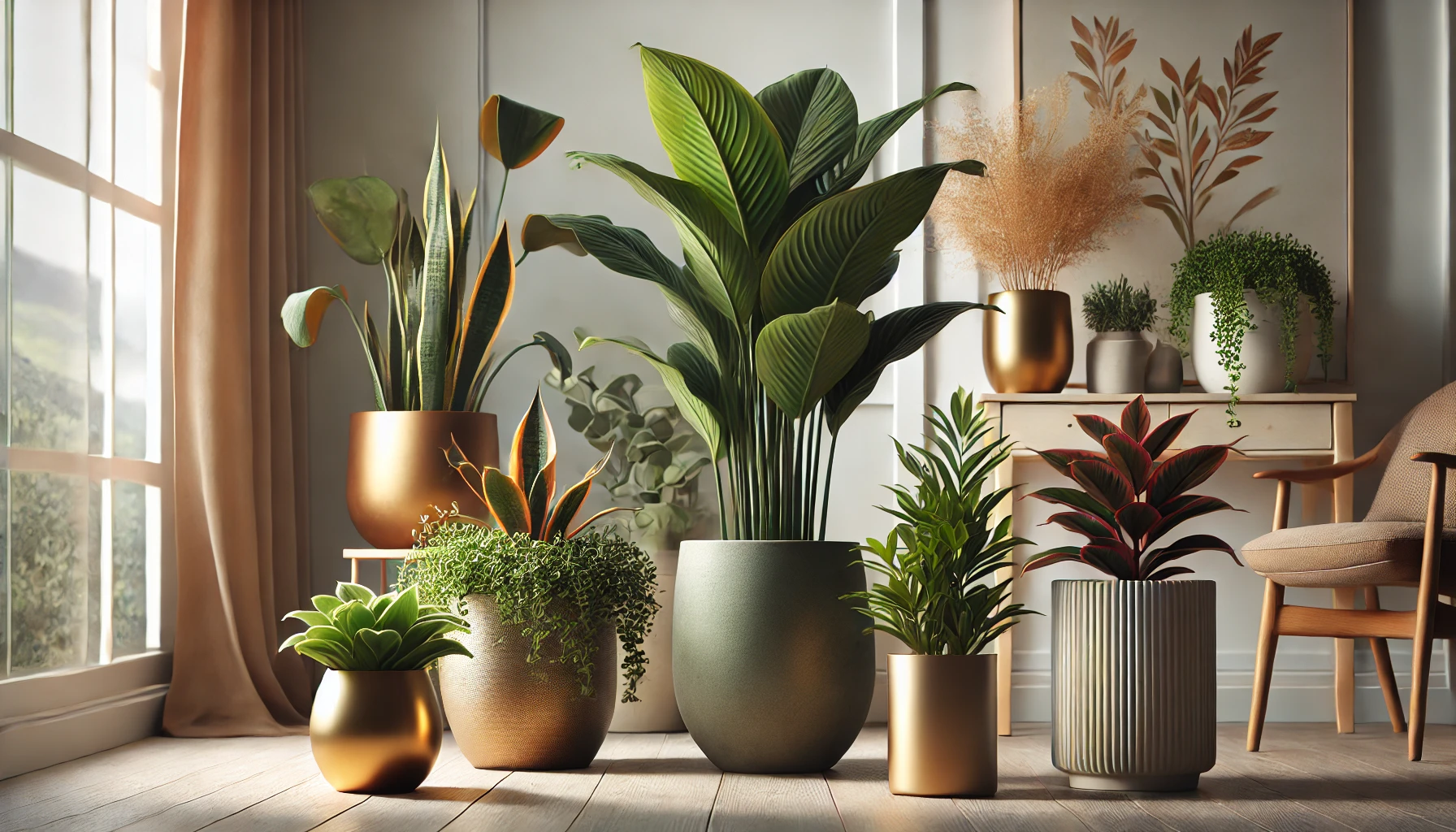
- Neutral Pots: If your plant has bold or colorful leaves, pair it with a neutral pot (white, beige, grey, or black). This lets the plant’s natural beauty shine without competing for attention. 🌚
- Bold Pots for Bold Plants: If you’re styling plants with more neutral tones (like green), you can go for a vibrant pot. Think of a deep blue or burnt orange pot for a pop of color that enhances the plant’s green foliage. 💙🧡
Consider Pot Materials and Texture 🏺🌿
The material of the pot can add texture and interest, complementing your plant’s color.
- Terracotta Pots: These earthy, warm tones are perfect for plants with deep green leaves or succulents, adding a natural, rustic touch. 🍂
- Ceramic Pots: Sleek and shiny, ceramic pots are perfect for creating contrast with lush plants. You can choose matte or glossy finishes, depending on the vibe you’re going for. 🏺✨
- Metal Pots: For a modern, industrial look, metallic pots like gold or silver can make colorful plants pop, adding a sophisticated touch. 🌟
Match Pot Style with Room Décor 🛋️
The style of your container should also reflect the overall theme of the room.
- Minimalistic Spaces: Opt for simple, elegant pots in neutral colors that blend seamlessly with your modern decor. 🤍
- Boho or Eclectic Styles: Don’t be afraid to mix and match patterned, textured, or vibrant pots that create a more whimsical look. 🌈
By carefully selecting the right pots, you can enhance your plant’s beauty while maintaining a harmonious color-coordinated theme throughout your home! 🌿✨
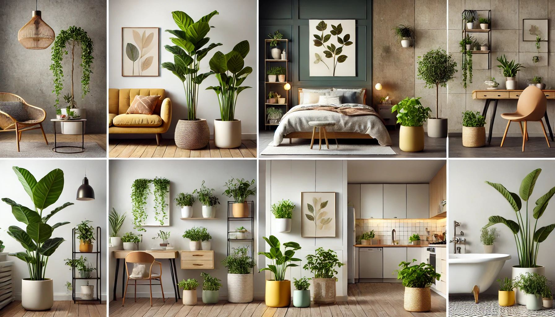
Styling Your Houseplants in Different Rooms 🌿🏠
Every room in your home has its own vibe, and styling your houseplants to match can make a huge difference. Let’s explore how to place and style your plants in different spaces, ensuring that each room gets a burst of color and life. 🌸
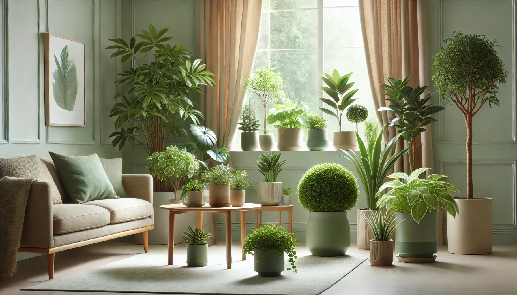
Living Room 🛋️
The living room is often the heart of the home, and it’s where you can go big with plant styling!
- Focal Points: Use tall plants like fiddle leaf figs or rubber plants in bold pots as statement pieces near windows or corners. 🌳
- Groupings: Group plants of varying sizes and colors together to create a lush, cozy corner. Combine plants with different shades of green and vibrant flowering plants for a balanced display. 🌿🌺
- Style Tip: Opt for neutral or earthy tones in your pots to complement the furniture and keep the space feeling grounded.
Bedroom 🛏️
Your bedroom is your sanctuary, so choose plants that promote relaxation and tranquility.
- Calming Greens: Soft green plants like snake plants or peace lilies work wonders in creating a calm, restful environment. 🪴
- Subtle Pops of Color: Incorporate plants with light pink or white flowers, like begonias or jasmine, to add a soft touch without overwhelming the space. 🌸
- Style Tip: Go for muted or pastel-colored pots to complement soothing tones in bedding and decor.
Kitchen 🍳
Kitchens are energetic spaces, and plants can add a refreshing touch!
- Herbs and Edible Greens: Use small pots with fresh herbs like basil, mint, or thyme. These plants not only add greenery but are practical too! 🌿
- Vibrant Accents: Brightly colored pots in yellow, red, or teal can bring a fun, lively feel to the space. 🌞
- Style Tip: Place plants near windows where they’ll get plenty of sunlight, creating a warm and welcoming kitchen corner.
Office Space 💻
Plants in your office can enhance productivity while adding beauty to the space.
- Energizing Greens: Choose plants like the snake plant, pothos, or ZZ plant to boost the energy in your workspace. 🌱
- Bright Pops of Color: Add plants with colorful foliage or flowers to inject creativity and motivation into your environment. 🌺
- Style Tip: Go for sleek, modern pots in neutral or metallic tones that match your office decor. Keep things minimal to avoid distractions.
Bathroom 🚿
Bathrooms offer the perfect space for smaller plants that thrive in humidity.
- Tropical Vibes: Use plants like ferns, orchids, or air plants that love moisture. 🌿
- Subtle Color: Opt for white or light-colored pots that complement bathroom fixtures while creating a clean, fresh vibe. 🌸
- Style Tip: Place plants on shelves, countertops, or even in hanging planters to save space and add greenery without cluttering.
By thoughtfully styling your houseplants in different rooms, you can enhance the mood and functionality of each space while maintaining a cohesive, color-coordinated theme throughout your home! 🌟
Using Color Coordination for Seasonal Variations 🍂🌸
Just like the seasons change outside, your indoor plant styling can shift to reflect the vibe of each season. Using color coordination to match the seasons can keep your home feeling fresh and lively all year round. Let’s explore how to tweak your houseplant styling for seasonal variations! 🍃❄️
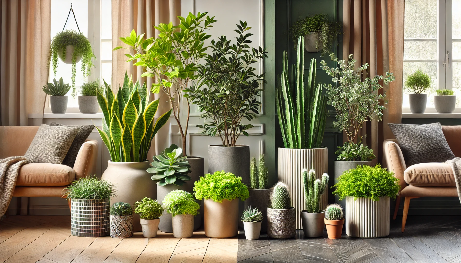
Spring/Summer 🌞
During these warmer months, it’s all about light, airy, and vibrant colors to reflect the energy of nature.
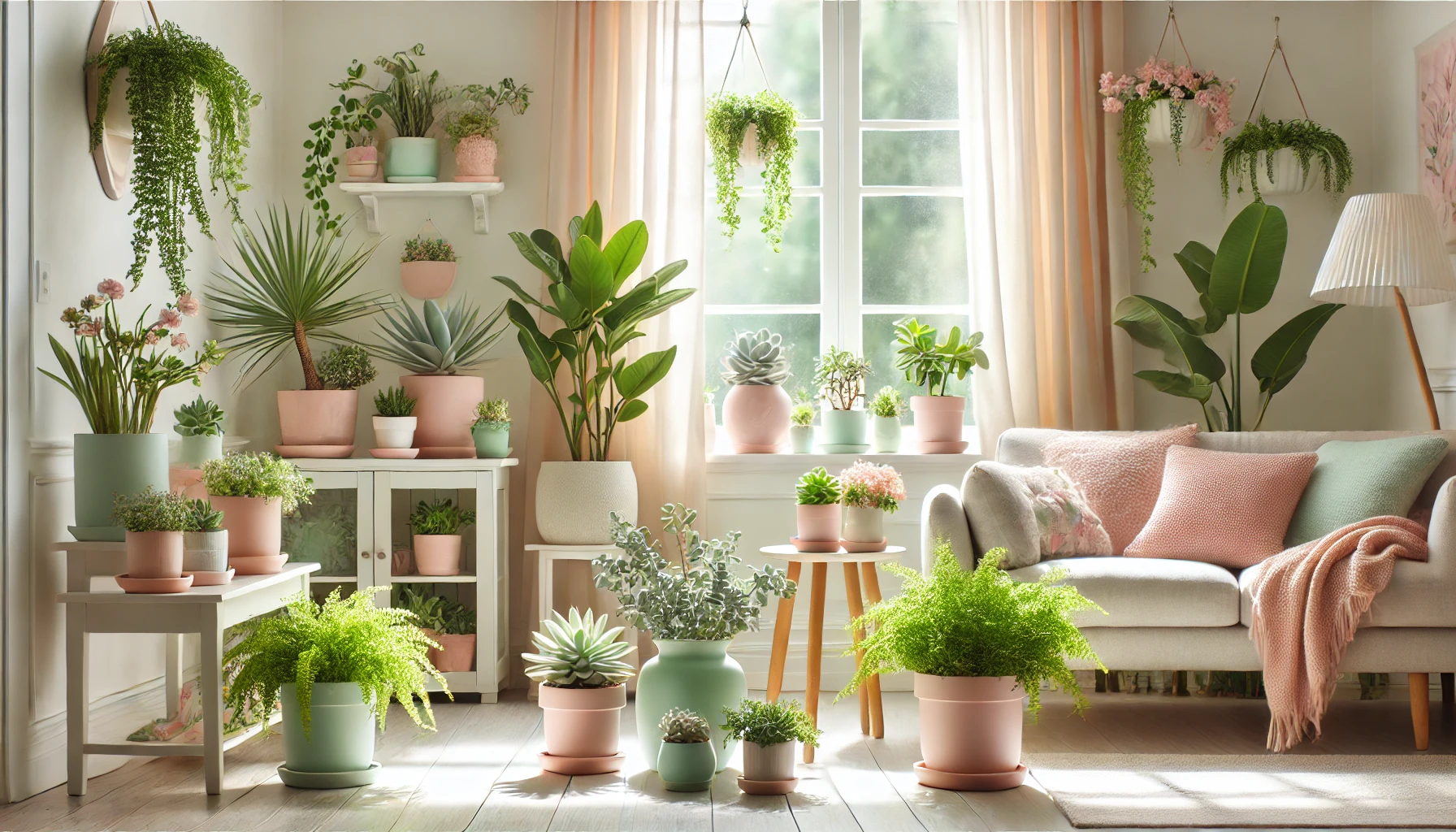
- Lighter Greens and Pastels: Opt for plants with softer green tones and light pastel-colored pots. Think of pale pink pots paired with soft green succulents or light ferns for a fresh look. 🌱💖
- Bright, Cheerful Accents: Incorporate plants that flower, like begonias or geraniums, in bright-colored containers (think yellows, oranges, or soft blues) to create a cheerful, sun-filled atmosphere. 🌼
- Style Tip: Use plenty of natural light to highlight the freshness of these colors, making your space feel welcoming and rejuvenated.
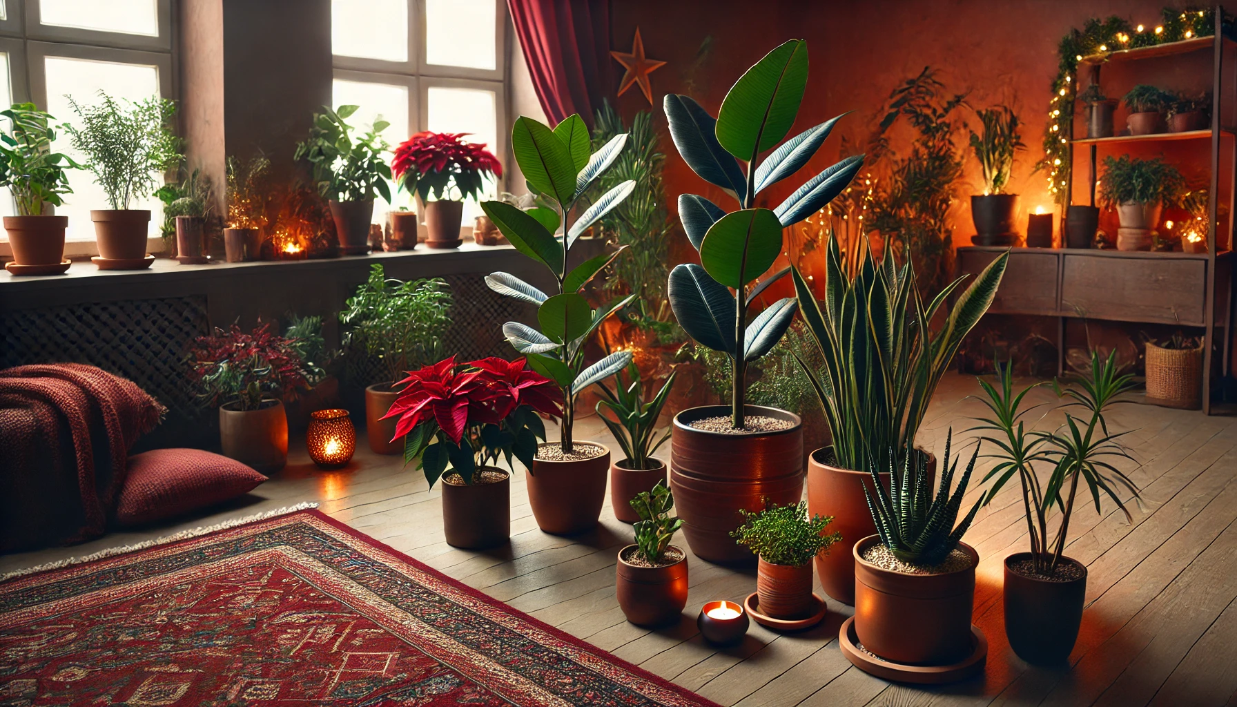
Fall/Winter 🍁❄️
As the temperatures drop, your plant styling can turn to deeper, richer tones to create a cozy, inviting environment.
- Warm, Earthy Hues: Swap out pastel pots for deep terracotta, burgundy, or gold to evoke a sense of warmth. 🍂🍷
- Dark Greens & Burgundy: Plants with dark green leaves, such as rubber plants or dracaenas, paired with rich-colored containers, can make your space feel cozy and sophisticated. 🌿
- Style Tip: Consider adding plants like orchids or poinsettias with deep red or white flowers to add a festive touch during the holidays. 🎄
Transitioning Between Seasons 🌿🍃
As we move from one season to the next, updating your plant colors can help your home feel in tune with the changing weather.
- Mixing Light & Dark: Combine the light, refreshing colors of spring with the deeper tones of fall. For example, place a pale green plant in a neutral pot and pair it with a dark, textured container for balance. 🍂🌱
- Focus on Seasonal Plants: Consider introducing seasonal plants like mums in fall or a small Christmas cactus during winter, giving your space a natural, seasonal flair. 🎋
- Seasonal Pot Refresh 🪴✨
Changing up your plant pots as the seasons shift can be an easy way to update your home’s aesthetic without completely redoing your space.
- Spring/Summer Pots: Opt for lightweight, airy materials like ceramic or terracotta in soft tones.
- Fall/Winter Pots: Consider heavier materials like stone or metal in deeper, richer colors to add a sense of warmth to your decor.
By aligning your houseplant colors and containers with the seasons, you can ensure that your home feels vibrant in the spring and cozy in the fall, keeping everything in perfect harmony year-round! 🍂🌸
Creating a Cohesive Look with Grouping Plants 🌿🌟
One of the easiest ways to create a stunning color-coordinated plant display is by grouping plants together. When done right, plant groupings can add visual interest, depth, and harmony to any room. Here’s how to group your plants to create a cohesive, stylish look. 🪴💚
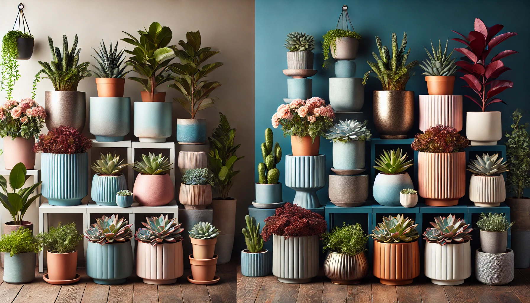
Grouping by Color Palette 🌈
Create harmony by grouping plants that share similar colors.
- Green-on-Green: Combine different shades of green plants (light greens, dark greens, variegated) in similar pots to create a monochromatic, calming effect. 🍃
- Bold Pops of Color: If you want a more vibrant display, group plants with different colored leaves (red, purple, yellow) together. Choose pots in complementary tones to make the colors pop even more. 🌸🌺
- Style Tip: Keep the pot colors consistent in each grouping for a polished, organized look. Neutral-colored pots work well for both bold and subtle plant combinations.
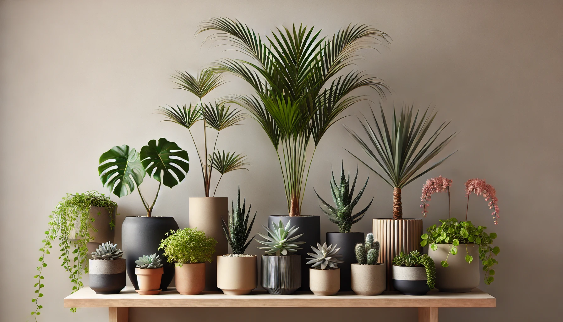
Varying Heights and Shapes 🌳
For a more dynamic arrangement, mix plants with different heights, shapes, and textures.
- Tall & Short Plants: Combine taller plants like fiddle leaf figs or palms with smaller, compact plants like succulents or pothos. This creates an interesting contrast and draws the eye upward. 🌱🌳
- Filling the Gaps: Use plants with trailing vines, like string of pearls or ivy, to fill gaps between larger plants. This adds layers and visual intrigue to your plant grouping. 🌿
- Style Tip: Arrange taller plants at the back and shorter plants in the front to maintain a balanced look.
Using Containers to Enhance Groupings 🪴✨
The right containers can tie your grouped plants together, adding style and unity to your display.
- Matching Pots: Choose pots of similar sizes and colors for a cohesive look. For example, using a set of white ceramic pots for a collection of green plants can bring harmony. 🤍
- Mixing Pots & Textures: For a more eclectic style, combine different textures—like a matte black pot with a shiny gold one—but keep the colors in a similar palette. 🖤💛
- Style Tip: Use decorative trays or plant stands to create a unified space for your plant groupings. This adds structure and draws attention to the plants without making the space feel cluttered.
Creating Focal Points with Groupings 🎯
Plants can also be grouped to serve as focal points in a room.
- Central Plant Displays: If you have a large plant like a monstera or rubber plant, group smaller plants around it to make it stand out. This creates a lush, centered look that naturally draws the eye. 🌿
- Style Tip: Pair plants with complementary colors in matching or contrasting pots around your focal plant for a balanced and cohesive display.
By thoughtfully grouping plants based on color, size, and texture, you can create a stunning, cohesive look that enhances the overall aesthetic of your home. Whether you’re aiming for calm and subtle or bold and vibrant, grouping plants can instantly elevate your space! 🌱✨
Common Mistakes to Avoid in Color-Coordinated Houseplant Styling 🚫🌿
While color-coordinated houseplant styling can completely transform a space, there are a few common mistakes that can disrupt the harmony of your design. Let’s go over these pitfalls so you can avoid them and create a perfectly balanced look! 🌸
Overusing Too Many Bold Colors 🌈
It’s tempting to add every color in the rainbow, but too many bold, bright plants and pots can overwhelm a space.
- Mistake: Mixing vibrant plant colors (reds, purples, yellows) with equally bold pots may clash and make your room feel chaotic.
- Solution: Stick to a cohesive color palette. Pair bold plants with neutral or muted pots to allow the colors to pop without feeling overpowering. 🌿
Ignoring the Size and Shape of Containers 🏺
Not considering the scale of your containers can create an unbalanced look.
- Mistake: Using too many large, heavy pots can crowd the space, while tiny pots might look out of place next to larger plants.
- Solution: Aim for a balance in pot sizes—taller plants in bigger pots and shorter plants in smaller containers. This creates visual interest without overcrowding the area. 🌱
Forgetting About Light and Placement ☀️
The best color-coordinated styling won’t matter if your plants don’t get the right amount of light or if they’re placed in a poorly lit area.
- Mistake: Placing plants in dark corners, where they may not thrive, can make your color coordination efforts look dull.
- Solution: Consider the light requirements of each plant when choosing placement. Bright, indirect light is great for most houseplants, while low-light plants like snake plants or pothos can tolerate darker spots. 🌞
Using Too Many Similar Shades of Green 💚
While green is versatile and calming, using only similar shades of green plants can make the space feel monotonous and flat.
- Mistake: Sticking with just one shade of green for all your plants without adding variety can make the room feel lifeless.
- Solution: Mix in different plant types, including those with varied leaf textures, sizes, and shades of green. You can also add plants with colorful foliage for contrast. 🌱🍂
Ignoring the Overall Room Aesthetic 🏡
Your plant styling should complement your home decor, not clash with it.
- Mistake: Choosing plant colors or pots that don’t align with your existing room style can make your plants feel out of place.
- Solution: Match your plants and containers to the overall aesthetic of the room. If you have a minimalist, modern space, go for sleek, simple pots. For a boho style, choose textured or colorful pots. 🪴✨
Overcrowding the Space 🚶♀️
While grouping plants can create a lush look, overcrowding can make a room feel cluttered and cramped.
- Mistake: Piling too many plants together can make your space look chaotic, leaving little room to breathe.
- Solution: Leave enough space between plant groupings to allow each plant to shine. Let each one have its own moment in the room. 🌿
By being mindful of these common mistakes, you’ll be able to create a beautifully balanced and harmonious space that highlights your plants and complements your decor. Happy styling! 🌸🌿
Final Thought
Mastering color-coordinated houseplant styling is all about creating a harmonious blend of colors, textures, and placement that enhances your home’s atmosphere. By understanding the basics of color coordination, choosing the right containers, and styling your plants to match each room’s vibe, you can turn your home into a lush, vibrant sanctuary. 🌱
Remember to avoid common mistakes like overcrowding or ignoring light needs, and focus on creating a balanced, cohesive look that reflects your personal style. Whether you’re adding pops of color or embracing calming green tones, the key is to make sure your plants are thriving in their environment while bringing joy and beauty to your space. 🌸
With these tips in mind, you’re ready to elevate your plant styling game and bring a touch of nature and elegance into every room. Happy planting! 🪴🌿